The Norwegian election survey: Voting patterns across generations.

Predicting election outcomes has in the recent years been a popular activity among data analytics. I guess you all know how Nate Silver became known for his predictions in the United States elections. Next year is Norwegian election for parliament and I have been thinking about maybe making an attempt at predicting the results when that time comes. There are already some people in Norway doing this, like the pollofpolls.no website and the Norwegian Computing Center.

In the meantime I decided to take a look at some historical data. After each election in Norway a large survey (1500-2000+ respondents) is carried out in an attempt to figure out why people voted what they did. This has been going on since the 1950’s and includes both local and national elections. The data from the surveys are available online from the Norwegian Center For Research Data. Only raw data from the oldest surveys are available for immediate download, but the online analytics tool at the website can be used to create simple tabulations of the all variables in the raw data and the results can downloaded as spreadsheets.

The obvious thing to look at in data like these are if there are any correlations between voting patterns and demographic variables. Gender, income and geography are obvious ones, but they are pretty boring boring, so I didn’t want to look at those. Instead I decided to look at what the relationship between birth year and party preference were.

I used the online tool and tabulated year of birth (or age, if that was the only available) against which party each respondent voted and downloaded the raw numbers. I did this for each survey all the available national elections, and the local elections in this millennium. This gave data on 17 elections from 1957 to 2013. I then cleaned the data a bit, threw out the category of parties termed “others” (usually less than 2% of the votes), calculated the birth year from age where necessary, and a bunch of other small details. With 1500+ respondents, about 70 birth years in each election and about 7 parties gives about 3 to 4 respondents in each cell, on average. Some parties have much lower support, so these tend to have even lower counts. It was therefore necessary to aggregate the birth years into groups. After some experimenting, I ended up by grouping them in 7 year bins.

What makes birth year more interesting to look at than age is that it gives a window back in time. By looking at age only you get a range of ages from 18 to about 90, but when you look at this data from the birth cohort view you can see 150+ years back in time. The oldest respondent in the data set was born in 1865.

Okay, on to some plots. We can start out with the the support for the Labour Party which has been the most popular party in the time after WWII.

cohort_dna

Each line in this plot is one election. The colors goes from black (the 1957 election) to red (the 2013 local election). We see that the general trend is that the Labour Party have most support among voters born before 1950, and that there is a decline among younger generations. We also see a trend where they are not as popular as they used to be in the 1960’s and 70’s, which is also seen in the generations born in the pre-1950’s cohorts. The dark red line at the bottom is the 2001 election, where the they did their worst election since the 1920’s.

So let’s take a look at the support for the Conservative Party, the second most popular party.

cohort_h

Unlike the Labour Party, there does not seem to be any generational trend at all. The Conservatives has usually received between 15-25% of the votes, except at a period in the 1980’s, where they received 30%.

The next party up is the Progress Party, which is currently in a coalition cabinet with the Conservative Party. The first election they participated in was the 1973 election, so the birth year series don’t go as far back as the other parties.

cohort_frp

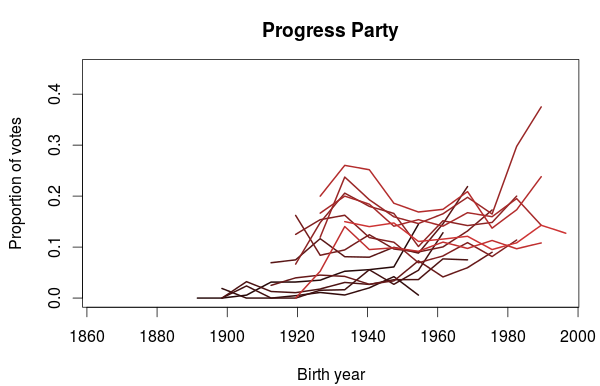
I think this plot is very interesting. It looks like the Progress Party is popular among people born in the 1930’s but also among the young voters. Notice how the rightmost part of each lines tend to point upwards. The 1930’s birth trend does not however seem to be present in the earliest elections (those with the darkest lines), but the popularity among the youngest part of the election cohort is there.

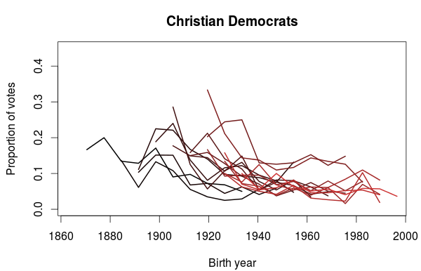
The support for the Christian Democratic Party also show some interesting trends. In the plot below we clearly see that they get a sizable portion of their votes from people born before 1940’s. Also noticeable are the two elections in the 1990’s where they did particularly well, where a lot of younger voters also voted for them. Does it also look like a small bump in popularity for voters born in the 1980’s? It could be just a coincidence, so it will be interesting to see if this appears in the next election as well.

cohort_krf

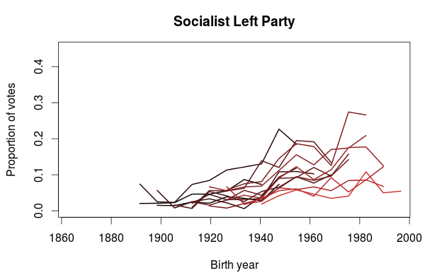
The last plot I want to show is for the Socialist Left Party. What this plot clearly shows is that the Socialist Party is more popular among the younger generations than the older. This does not mean we can extrapolate this into future elections and predict an increased popularity. On the contrary, we also see that their decreasing popularity since their peak in 2001 also applies to the younger generations. One could speculate that some of the younger voters have left the Labour Party in favor of the Socialist Party, and that will be the topic in a future blog post.

cohort_sv

Gender differences in ski jumping at the Olympics

I had a discussion with some friends the other day about separate sports competitions for men and women. In some sports, like curling, it seems rather unnecessary to have separate competitions. At least assuming the reason for gendered competitions is that being a male or a female may give the competitor an obvious advantage. One sport where we didn’t think it was obvious was ski jumping, so I decided to look at some numbers.

This year’s Olympics was the first time women competed in ski jumping so decided to do a quick comparison of the results from the final round in the men’s and women’s final.

This is what I came up with:
skijump

What we see are the estimated distributions for the jump distances for men and women. The mode for the women seems to be a little lower than the mode for the men. We also see that there is much more variability among the women jumpers than among the men and that the women’s distribution have a longer right tail. Still, it looks like the best female jumpers are on par with the best male jumpers and vice verca.

The numbers I used here are not adjusted for wind conditions and other relevant factors, so I will not draw any firm conclusions. I hope to have time to look more into this later, using data from more competitions, adjusting for wind etc.

Very accurate music reviews are perhaps not so useful

Back in august i downloaded all album reviews from pitchfork.com, a hip music website mainly dealing with genres such as rock, electronica, experimental music, jazz etc. In addition to a written review, each reviewed album is given a score by the reviewer from 0.0 to 10.0, to one decimal accuracy. In other words, a reviewed album is graded on a 101 point scale. But does it make sense to have such an accurate grading scale? Is it really any substantial difference between two records with a 0.1 difference in score? Listening to music is a qualitative experience, and no matter how professional the reviewer is, a record review is always a subjective analysis influenced by the reviewers taste, mood and preconceptions. To quantify musical quality on a single scale is therefore a hard, if not impossible, feat. Still, new music releases is routinely reviewed and graded in the media, but i don’t know of anyone having a grading system to the accuracy that Pitchfork does. Usually there is a 0 to 5 or 0 to 10 scale, perhaps to the accuracy of a half. There are sites like Metacritc and Rotten Tomatoes (for film reviews) that has a similar accuracy to their reviews, but they are both based on reviews collected from many sources. In the case of Pitchfork, there is usually just one reviewer (with a few reviews credited to two or more people). As far as i know pitchfork has no guidelines on how to interpret the score or what criteria they use to set the score and it may just be up to the reviewer to figure out what to put in the score.

Anyway, I extracted the information from the reviews i downloaded and put it into a .csv file. This gave me data on 13330 reviews which i then loaded into R for some plotting with ggplot2. Lets look at some graphs to see how the scores are distributed and try to find something interesting. First we have a regular histogram:

When I first saw it I was not expect the distribution to be so right skewed. I expected the top to be around maybe 5 or 6. I calculated the mean and median which are 6.96 and 7.2, respectively. Lets look at a bar plot, where each bar corresponds to a specific score.

Now this is interesting. We can clearly see four spikes around the top, some scores are clearly more popular than others. ggplot2 clutters the ticks on the x-axis so it is difficult to see exactly which scores it is (this seems to be a regular problem with ggplot2, event the examples in the official documentation suffers from this) Anyway, I found out that the most popular scores are 7.5 (620 records), 7.0 (614 records), 7.8 (611 records) and 8.0 (594 records). Together, 18.3% of the reviewed records has been given one of these four scores. From this it seems to be some sort of bias towards round or ‘half round’ numbers. I guess we humans have some sort of subconscious preference for these kinds of numbers. If we now look closer at the right end of the plot, we see the same phenomena:

The 10.0 ‘perfect’ score is way more used than the scores just below it. So it appears to be harder to make a ‘near perfect’ album than a perfect one, which is kind of strange. If I were to draw some conclusion after looking at these charts, it would be that a 101 point scale is too accurate to be useful for distinguish between albums that differ little in their numeric scores. I also wonder if this phenomenon can be found in other situations where people are asked to grade something on a scale with similar accuracy.

Looking at monthly distribution of births in Norway

A news story earlier this week reported an increased number of births during the summer months in Norway. According to the story the peak in births used to be in the spring months, nine months after summer vacation, but is now during the summer. The midwifes thinks this change is because of the rules for granting a place in preschool day care. Children born before september 1st are legally entitlet to a place in day care.

Anyway i decided to try to visualize this. I found some data at the Statistics Norway website, loaded it into R, cleaned it, restructured it etc. and made this animation with ggplot2 showing the monthly distribution of births from year 2000 to 2011. I decided to include data for the years before 2005 since that is when the current left wing coalition took office and they had a program for universal access to day care. It is hard to spot a definite trend, but the graph for 2011 shows a clear top in the summer months. It will be interesting to see if this becomes clearer the next couple of years. Also, if this becomes a continuing trend, it would be interesting to look at surveys in family planning and see if there has been more of it the last couple of years.

The birthIndex on the y-axis is not the precise number of births for a given month, but is corrected for the number of days in the month. This makes the different months comparable.