In my last post on Elo ratings I used a graph to illustrate why it is hard to compare the strengths of teams that play in different leagues.
This is based on data from two half-seasons of English Premier League and the Championship. Each team is represented by a node or vertex, which is drawn as a circle. Each edge between the nodes is drawn as line between them and indicates that the two teams have against played each other at least once. I didn’t add team names to the graph, but the orange nodes are the teams that played in the Premier League in both seasons, while the blue nodes are teams that played in the Championship or got promoted or relegated. The graph shows both why comparisons between teams in different leagues can be difficult, and why including data from the Championship can improve the prediction of Premier league matches. In this post I will go more into details about what I call the comparison graph and how it can be used.
We can easily recognize a few patterns in the graph above. The most obvious one is the cluster of several teams where everyone (or nearly everyone) has played against each other. In a fully played season every team has played each other and the graph is said to be fully connected. If the graph is fully connected we should be able to have a good idea about the relative strengths between every team. Here is an example of a fully connected graph representing a fully played season with 10 teams.
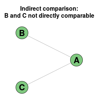
Another important pattern is the lack of edges between two teams. If two teams hasn’t played each other, but both has played a third team, they are indirectly comparable. Here we see that both Team B and Team C has played team A, but they have not played each other.
If you are going to predict the outcome of a match between Team B and Team C this graph shows you that you should be careful. The information we have of the relative strengths between them is only indirect. This can in some situations where you have very limited data be almost the same as having no data at all. Suppose both Team C and Team B won huge victories over Team A. This would perhaps indicate that Team A is crap, but we would have very little indication which of Team B and Team C is better. If on the other hand Team A beat Team C, and Team B beat Team A, we would have had a strict ordering, so it does not automatically mean that we can’t make anything out of the data.
Another important pattern in a graph is whether there are any disconnected subgraphs. Here we have two or more groups of teams that has played only against other teams within their own group, but not against the teams in the other groups. In the first few rounds of a season we can see patterns like this.
Here's a graph of why you can't make any concl. after round 2 at least. Edges are games between teams. pic.twitter.com/44QBQQLsnq
— Jonas (@opisthokonta) August 25, 2016
There are a lot of interesting things you can do with the comparison graph, but that will make for a future post.


