The Norwegian election survey: Voter turnout across generations and age groups

In the last post I used data from the Norwegian election survey to look at how party preferences changed between generations. One thing I didn’t look at was if there was any differences in participation between the generations. While the Norwegian elections generally has a high turnout, the general trend has been a decline. Some numbers on voter turnout are available from Statistics Norway, and a plot of turnout for the national elections for parliament and the local elections show that this is especially true for the local elections. For the parliament elections there seems to be a sudden drop in turnout at the 1993 election. Before that the general turnout was somewhere between 80% and 85%. From 1993 and onwards it has been somewhere between 75% and 80%.

turnout_elections

This time I decided to only look at the surveys done in connection with the parliamentary elections. This was to avoid much clutter with the differences between the local and national elections. After I gathered the data from the elections surveys using the web analysis tool at the web page for Norwegian Center For Research Data (see the link above), I plotted the voter turnout for each election for each birth cohort (in 7-year groups). In the plot is each election represented by a line. The same thing I did in the previous post, in other words.

turnout_cohort

We clearly see a trend in which younger generations, those born after about 1955, are less likely to vote. But there is also a clear indication that the young voters, when they get older, are more likely to vote. This trend can for example be seen for the 1970-generation. The earliest generations where this group could vote are those lines where the line ends in about 1970. In the earliest elections where this group could vote, more than 25% did not vote, but in the more recent elections only 10% of this generation did not vote.

Also notice how in each election, the oldest group also seem to have a tendency to not vote. This could perhaps be explained by the older population generally has poorer health and will therefore not prioritize to get out to vote. But I also suspect this is partially explained by random variation, as the oldest birth groups have relatively few respondents in the surveys.

We can plot the turnout by age instead of birth year to get a better view of the differences between age groups. Here I used 5-year groups instead of 7. In this plot the lines do seem to align a bit better.

turnout_age

Still another figure we could do is to plot the turnout for different age groups, and then see how this has changed from election to election. Here I have plotted only two age groups, those 25 or younger, and those older than 25. Also shown is the national turnout, which is not from the election survey, but are the official turnout numbers. This is the same as in the first plot above.

turnout_young

We see again that the young voters have lower turnout than the older ones, which by now should be no surprise. In addition, the difference between the young and the old seem follow each other between the elections to a large degree, going up and down in a similar pattern, but it also become noticeably wider from the 1993 election. From just looking at this plot, it could seem as if the lower turnout among the young could explain a lot of the decrease that happened in the 1993 election, but keep in mind that the younger group is a relatively small group. Not pictured in the plot is the uncertainty of the estimates, which gives the unreasonable results in the 1965 and 1985 elections, where both the young and old have higher turnout (as measured by the survey) than the official numbers.

So from looking at these plots, it seems like when people where born, what age you are and which election it is influence whether you vote or not. But the effect of these three aspects is hard, if not impossible, to untangle. The reason for this is simple: How old you are is fully determined by when you are and when you were born. You can of course turn it around and say the same for the two other aspects: If you know two of them, you also know the third. From a modeling point of view this dependency makes it hard to put these three variables in a regression model, but there are some literature out there on how this kind of Age-Period-Cohort analysis (as it is called) could be done.

But does this mean we can’t really learn anything from it? I think we can. The kind of analysis like the one I have done here is of course rather informal and descriptive, no p-values or effect sizes or stuff like that, but I think it is clear that age plays an important role. The third plot, with age on the horizontal axis, looks much nicer than the second plot, with birth year on the horizontal. The lines align rather nicely. We can also see this in the cohort plot, where the 1970-generation had a low turnout in the first elections they could participate in, but in the more recent elections they participate as much as those born before that.

Whether the changes in participation among the young over time is a period effect or a cohort effect is more difficult to say. It seems to covary with the general trend, but it also has it’s own component. This does not seem to play a large role, except perhaps a change at the 1985 election (or among those born in the 1960’s, depending on your view).

The Norwegian election survey: Voting patterns across generations.

Predicting election outcomes has in the recent years been a popular activity among data analytics. I guess you all know how Nate Silver became known for his predictions in the United States elections. Next year is Norwegian election for parliament and I have been thinking about maybe making an attempt at predicting the results when that time comes. There are already some people in Norway doing this, like the pollofpolls.no website and the Norwegian Computing Center.

In the meantime I decided to take a look at some historical data. After each election in Norway a large survey (1500-2000+ respondents) is carried out in an attempt to figure out why people voted what they did. This has been going on since the 1950’s and includes both local and national elections. The data from the surveys are available online from the Norwegian Center For Research Data. Only raw data from the oldest surveys are available for immediate download, but the online analytics tool at the website can be used to create simple tabulations of the all variables in the raw data and the results can downloaded as spreadsheets.

The obvious thing to look at in data like these are if there are any correlations between voting patterns and demographic variables. Gender, income and geography are obvious ones, but they are pretty boring boring, so I didn’t want to look at those. Instead I decided to look at what the relationship between birth year and party preference were.

I used the online tool and tabulated year of birth (or age, if that was the only available) against which party each respondent voted and downloaded the raw numbers. I did this for each survey all the available national elections, and the local elections in this millennium. This gave data on 17 elections from 1957 to 2013. I then cleaned the data a bit, threw out the category of parties termed “others” (usually less than 2% of the votes), calculated the birth year from age where necessary, and a bunch of other small details. With 1500+ respondents, about 70 birth years in each election and about 7 parties gives about 3 to 4 respondents in each cell, on average. Some parties have much lower support, so these tend to have even lower counts. It was therefore necessary to aggregate the birth years into groups. After some experimenting, I ended up by grouping them in 7 year bins.

What makes birth year more interesting to look at than age is that it gives a window back in time. By looking at age only you get a range of ages from 18 to about 90, but when you look at this data from the birth cohort view you can see 150+ years back in time. The oldest respondent in the data set was born in 1865.

Okay, on to some plots. We can start out with the the support for the Labour Party which has been the most popular party in the time after WWII.

cohort_dna

Each line in this plot is one election. The colors goes from black (the 1957 election) to red (the 2013 local election). We see that the general trend is that the Labour Party have most support among voters born before 1950, and that there is a decline among younger generations. We also see a trend where they are not as popular as they used to be in the 1960’s and 70’s, which is also seen in the generations born in the pre-1950’s cohorts. The dark red line at the bottom is the 2001 election, where the they did their worst election since the 1920’s.

So let’s take a look at the support for the Conservative Party, the second most popular party.

cohort_h

Unlike the Labour Party, there does not seem to be any generational trend at all. The Conservatives has usually received between 15-25% of the votes, except at a period in the 1980’s, where they received 30%.

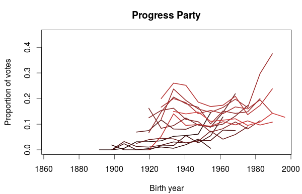
The next party up is the Progress Party, which is currently in a coalition cabinet with the Conservative Party. The first election they participated in was the 1973 election, so the birth year series don’t go as far back as the other parties.

cohort_frp

I think this plot is very interesting. It looks like the Progress Party is popular among people born in the 1930’s but also among the young voters. Notice how the rightmost part of each lines tend to point upwards. The 1930’s birth trend does not however seem to be present in the earliest elections (those with the darkest lines), but the popularity among the youngest part of the election cohort is there.

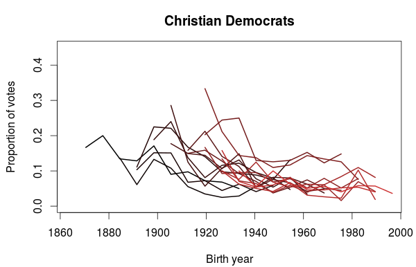
The support for the Christian Democratic Party also show some interesting trends. In the plot below we clearly see that they get a sizable portion of their votes from people born before 1940’s. Also noticeable are the two elections in the 1990’s where they did particularly well, where a lot of younger voters also voted for them. Does it also look like a small bump in popularity for voters born in the 1980’s? It could be just a coincidence, so it will be interesting to see if this appears in the next election as well.

cohort_krf

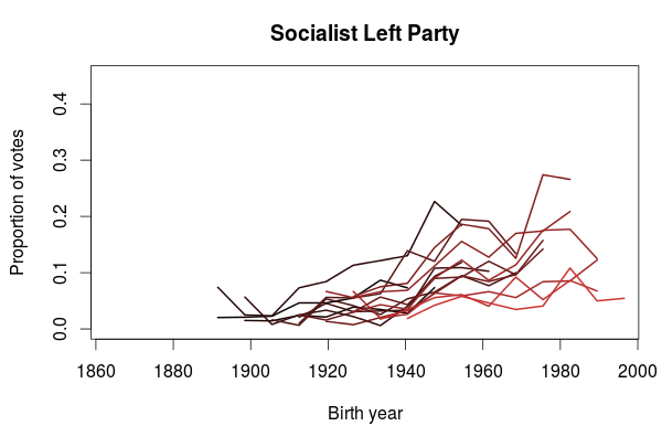
The last plot I want to show is for the Socialist Left Party. What this plot clearly shows is that the Socialist Party is more popular among the younger generations than the older. This does not mean we can extrapolate this into future elections and predict an increased popularity. On the contrary, we also see that their decreasing popularity since their peak in 2001 also applies to the younger generations. One could speculate that some of the younger voters have left the Labour Party in favor of the Socialist Party, and that will be the topic in a future blog post.

cohort_sv

Identifying gender bias in candidate lists in proportional representation elections

The Norwegian parliamentary elections uses a system of proportional representation. Each county has a number of seats in parliament (based on number of inhabitants and area), and the number of seats given to each party almost proportional to the number of votes the party receives on that county. Since each party can win more than one seat the parties has to prepare a ranked list of people to be elected, where the top name is given the first seat, the second name given the second seat etc.

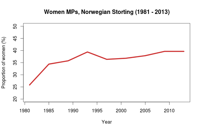
Proportional representation systems like the Norwegian one has been show to be associated with greater gender balance in parliaments than other systems (see table 1 in this paper). Also, the proportion of women in the Norwegian Storting has also increased the last 30 years:

stortingetkvinner

Data source: Statistics Norway, table 08219.

At the 1981 election, 26% of the elected representatives where women. At the 2013 election, the proportion was almost 40%. One mechanism that can explain this persistent female underrepresentation is that men are overrepresented at the top of the electoral lists. Inspired by a bioinformatics method called Gene Set Enrichment (GSEA) I am going to put this hypothesis to the test.

The method is rather simple. Explained in general terms, this is how it works: First you need to calculate a score witch represents the degree of overrepresentation of a category near the top of the list. Each time you encounter an instance belonging to the category your testing you increase the score, otherwise you decrease it. To make the score be a measure of overrepsentation at the top of the list the increase and decrease must be weighted accordingly. The maximum score of this ‘running sum’ is the test statistic. Here I have chosen the function \(\frac{1}{\sqrt(i)}\) where i is the number the candidate is on the list (number 1 is the top candidate).

To calculate the p-value the same thing is done again repeatedly with different random permutations of the list. The proportion of times the score from these randomizations are greater or equal to the observed score is then the p-value.

I am going to use this method on the election lists from Hordaland county from the 1981 and 2013 election. Hordaland had 15 seats in 1981, and 16 seats in 2013. 3 (20 %) women were elected in 1981 and 5 (31.3 %) in 2013. The election lists are available from the Norwegian Social Science Data Services and the National Library of Norway.

Here are the results for each party at the two elections:

Party 2013 1981
Ap 1 (0.43) 3.58 (0.49)
Frp 3.28 (0.195) 3.56 (0.49)
H 1.018 (0.66) 3.17 (0.35)
Krf 1.24 (0.43) 2.32(0.138)
Sp 2.86 (0.49) 2.86 (0.48)
Sv 1 (0.24) 0.29 (0.72)
V 1.49 (0.59) 1.37 (0.29)

The number shown is the score, while the p-value is in parenthesis. A higher score means a higher over representation of men at the top of the list.

Even if we ignore problems with multiple testing, none of the parties have a significant over representation of men at the top if the traditional significance threshold of \(p \le 0.05\) is used. This is perhaps unexpected, as at least the gender balance in the elected candidates after the 1981 election is significantly biased (p = 0.018, one sided exact binomial test).

This really tells us that this method is not really powerful enough to make inferences about this kinds of data. I think one possible improvement would be to somehow score all lists in combination to find an overall gender bias. One could also try a different null model. The one I have used here has randomly shuffled the list in question, maintaining the bias in gender ratio (if any). Instead a the observed score could be compared to random samplings where each gender were sampled with equal probabilities.

My final thought is that this whole significance testing approach is inappropriate. Even if the bias is statistical insignificant, it is still there to influence the gender ratio of the elected members of parliament. From looking at some of the lists and their scores, I will say that all scores greater than 1 at least indicate a positive bias towards having more men at the top.