Predicting football results with Poisson regression pt. 2

In part 1 I wrote about the basics of the Poisson regression model for predicting football results, and briefly mentioned how our data should look like. In this part I will look at how we can fit the model and calculate probabilities for the different match outcomes. I will also discuss some problems with the model, and hint at a few improvements.

Fitting the model with R
When we have the data in an appropriate format we can fit the model. R has a built in function glm() that can fit Poisson regression models. The code for loading the data, fitting the model and getting the summary is simple:

#load data
yrdta <- read.csv(“yourdata.csv”)

#fit model and get a summary
model <- glm(Goals ~ Home + Team + Opponent, family=poisson(link=log), data=yrdta)
summary(model)

The summary function for fitting the model with data from Premier League 2011-2012 season gives us this (I have removed portions of it for space reasons):

(Edit September 2014: There was some errors in the estimates in the original version of this post. This was because I made some mistakes when I formated the data as described in part one. Thanks to Derek in the comments for pointing this out. )

Coefficients:
                    Estimate Std. Error z value Pr(>|z|)    
(Intercept)          0.45900    0.19029   2.412 0.015859 *  
Home                 0.26801    0.06181   4.336 1.45e-05 ***
TeamAston Villa     -0.69103    0.20159  -3.428 0.000608 ***
TeamBlackburn       -0.40518    0.18568  -2.182 0.029094 *  
TeamBolton          -0.44891    0.18810  -2.387 0.017003 *  
TeamChelsea         -0.13312    0.17027  -0.782 0.434338    
TeamEverton         -0.40202    0.18331  -2.193 0.028294 *  
TeamFulham          -0.43216    0.18560  -2.328 0.019886 *
-----
OpponentSunderland  -0.09215    0.20558  -0.448 0.653968    
OpponentSwansea      0.01026    0.20033   0.051 0.959135    
OpponentTottenham   -0.18682    0.21199  -0.881 0.378161    
OpponentWest Brom    0.03071    0.19939   0.154 0.877607    
OpponentWigan        0.20406    0.19145   1.066 0.286476    
OpponentWolves       0.48246    0.18088   2.667 0.007646 ** 
---
Signif. codes:  0 ‘***’ 0.001 ‘**’ 0.01 ‘*’ 0.05 ‘.’ 0.1 ‘ ’ 1

The Estimate column is the most interesting one. We see that the overall mean is e0.49 = 1.63 and that the home advantage is e0.26 = 1.30 (remember that we actually estimate the logarithm of the expectation, therefore we need to exponentiate the coefficients to get interpretable numbers). If we want to predict the results of a match between Aston Villa at home against Sunderland we could plug the estimates into our formula, or use the predict() function in R. We need to do this twice, one time to predict the number of goals Aston Villa is expected to score, and one time for Sunderland.

#aston villa
predict(model, data.frame(Home=1, Team="Aston Villa", Opponent="Sunderland"), type="response")
# 0.9453705 

#for sunderland. note that Home=0.
predict(model, data.frame(Home=0, Team="Sunderland", Opponent="Aston Villa"), type="response")
# 0.999 

We see that Aston Villa is expected to score on average 0.945 goals, while Sunderland is expected to score on average 0.999 goals. We can plot the probabilities for the different number of goals against each other:

AstonVillaSunderland1

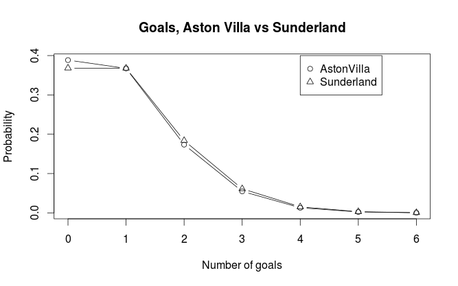
We can see that Aston Villa has just a bit higher probability for scoring not goals than Sunderland. Sunderland has also just a tiny bit higher probablity for most other number of goals. Both teams have about the same probability of scoring exactly one goal. In general the pattern we see in the plot is consistent with what we would expect considering the expected number of goals.

Match result probabilities
Now that we have our expected number of goals for the two opponents in a match, we can calculate the probabilities for either home win (H), draw (D) and away win (A). But before we continue, there is an assumption in our model that needs to be discussed, namely the assumption that the goals scored by the two teams are independent. This may not be obvious since surely we have included information about who plays against who when we predict the number of goals for each team. But remember that each match is included twice in our data set, and the way the regression method works, each observation are assumed to be independent from the others. We’ll see later that this can cause some problems.

The most obvious way calculate the probabilities of the three outcomes is perhaps to look at goal differences. If we can calculate the probabilities for goal differences (home goals minus away goals) of exactly 0, less than 0, and greater than 0, we get the probabilities we are looking for. I will explain two ways of doing this, both yielding the same result (in theory at least): By using the Skellam distribution and by simulation.

Skellam distribution
The Skellam distribution is the probability distribution of the difference of two independent Poisson distributed variables, in other words, the probability distribution for the goal difference. R does not support it natively, but the VGAM package does. For our example the distribution looks like this:
AstonVillaSunderland2
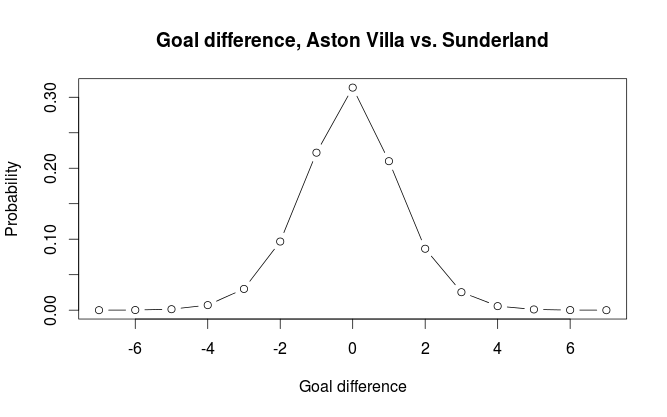
If we do the calculations we get the probabilities for home win, draw, away win to be 0.329, 0.314, 0.357 respectively.

#Away
sum(dskellam(-100:-1, predictHome, predictAway)) #0.3574468
#Home
sum(dskellam(1:100, predictHome, predictAway)) #0.3289164
#Draw
sum(dskellam(0, predictHome, predictAway)) #0.3136368

Simulation
The second method we can use is simulation. We simulate a number of matches (10000 in our case) by having the computer draw random numbers from the two Poisson distributions and look at the differences. We get the probabilities for the different outcomes by calculating the proportion of different goal differences. The independence assumption makes this easy since we can simulate the number of goals for each team independently of each other.

 set.seed(915706074)
nsim <- 10000
homeGoalsSim <- rpois(nsim, predictHome) 
awayGoalsSim <- rpois(nsim, predictAway)
goalDiffSim <- homeGoalsSim - awayGoalsSim
#Home
sum(goalDiffSim > 0) / nsim #0.3275
#Draw
sum(goalDiffSim == 0) / nsim # 0.3197
#Away
sum(goalDiffSim < 0) / nsim #0.3528

The results differ a tiny bit from what we got from using the Skellam distribution. It is still accurate enough to not cause any big practical problems.

How good is the model at predicting match outcomes?
The Poisson regression model is not considered to be among the best models for predicting football results. It is especially poor at predicting draws. Even when the two teams are expected to score the same number of goals it rarely manages to assign the highest probability for a draw. In one attempt I used Premier League data from the last half of one season and the first half of the next season to predict the second half of that season (without refitting the model after each match day). It assigned highest probability to the right outcome in 50% of the matches, but never once predicted a draw.

Lets see at some other problems with the model and suggest some improvements.

One major problem I see with the model is that the predictor variables are categorical. This is a constraint that makes inefficient use of the available data since we get rather few data points per parameter (i.e per team). The model does for example not understand teams are more like each other than others and instead view each team in isolation. There has been some attempts at using Bayesian methods to incorporate information on which teams are better and which are poorer. Se for example this blog. If the teams instead could be reduced to numbers (by using some sort of rating system) we would get fewer parameters to estimate. We could then also incorporate an interaction term, something that is almost impossible with the categorical predictor variables we have. The interaction term in this case would be the effect of a team under or over estimating its opponent.

(As an aside, we could in fact interpret the coefficients in our model as a form of rating of a teams offensive and defensive strength)

Another way the model can be improved is to incorporate a time aspect. The most obvious way to do this is perhaps to weights to the matches such that more recent matches are more important than matches far back in time.

A further improvement would be to look at the level of different players, and not at a team as a whole. For example will a team with many injured players in a match most likely perform poorer than what you would expect. One could use weights to down weight the contribution of matches where this is a problem. A much more powerful idea would be to combine data on match lineup with a rating system for players. This could be used to infer a rating for the whole team in a specific match. In addition to correct for injured players it would also account for new players on a team and players leaving a team. The biggest problem with this approach is lack of available data in a format that is easy to handle.

I don’t think any of the improvements I have discussed here will solve the problem of predicting draws since it originates in the independent Poisson assumption, although I think they could improve predictions in general. To counter the problem of predicting draws I think a very different model would have to be used. I would also like to mention that the improvements I have suggested here are rather general, and could be incorporated in many other prediction models.

Predicting football results with Poisson regression pt. 1

I have been meaning to write about my take on using Poisson regression to predict football results for a while, so here we go. Poisson regression is one of the earliest statistical methods used for predicting football results. The goal here is to use available data to to say something about how many goals a team is expected to score and from that calculate the probabilities for different match outcomes.

The Poisson distribution
The Poisson distribution is a probability distribution that can be used to model data that can be counted (i.e something that can happen 0, 1, 2, 3, … times). If we know the number of times something is expected to happen, we can find the probabilities that it happens any number of times. For example if we know something is expected to happen 4 times, we can calculate the probabilities that it happens 0, 1, 2, … times.

It turns out that the number of goals a team scores in a football match are approximately Poisson distributed. This means we have a method of assigning probabilities to the number of goals in a match and from this we can find probabilities for different match results. Note that I write that goals are approximately Poisson. The Poisson distribution does not always perfectly describe the number of goals in a match. It sometimes over or under estimates the number of goals, and some football leagues seems fit the Poisson distribution better than others. Anyway, the Poisson distribution seems to be an OK approximation.

The regression model
To be able to find the probabilities for different number of goals we need to find the expected number of goals L (It is customary to denote the expectation in a Poisson distribution by the Greek letter lambda, but WordPress seem to have problems with greek letters so i call i L instead). This is where the regression method comes in. With regression we can estimate lambda conditioned on certain variables. The most obvious variable to look at is which team is playing. Manchester United obviously makes more goals than Wigan. The second thing we want to take into account is who the opponent is. Some teams are expected to concede fewer goals, while others are expected to let in more goals. The third thing we want to take into account is home field advantage.

Written in the language of regression models this becomes

log(L) = mu + home + teami + opponentj

The mu is the overall mean number of goals. The home is the effect on number of goals a team has by playing at home. Teami is the effect of team number i, opponentj is the effect of team j.

(Note: Some descriptions of the Poisson regression model on football data uses the terms offensive and defensive strength to describe what I have called team and opponent. The reason I prefer the terms I use here is because it makes it a bit easier to understand later when we look at the data set.)

The logarithm on the left hand side is called the link function. I will not dwell much on what a link function is, but the short story is that they ensure that the parameter we try to estimate don’t fall outside its domain. In this case it ensures us that we never get negative expected number of goals.

Data
In my example I will use data from football-data.co.uk. What data you would want to use is up to yourself. Typically you could choose to use data from the last year or the least season, but that is totally up to you to decide.

Each of the terms on the right hand side of the equation (except for mu) corresponds to a columns in a table, so we need to fix our data a bit before we proceed with fitting the model. Each match is essentially two observations, one for how many goals the home team scores, the second how many the away team scores. Basically, each match need two rows in our data set, not just one.

Doing the fix is an easy thing to do in excel or Libre Office Calc. We take the data rows (i.e. the matches) we want to use and duplicate them. Then we need to switch the away team and away goals columns so they become the same as the home team column. We also need a column to indicate the home team. Here is an example on how it will look like:

In the next part I will fit the actual model, calculate probabilities and describe how we can make predictions using R.

Cinnamon 1.6.7 on Ubuntu 12.04

A couple of months ago I decided to check out the Cinnamon user interface. On my main working laptop I run Ubuntu 12.04 (LTS) which by default comes with Unity, Ubuntu’s own user interface. I thought I’d share some of my experience and thoughts on how it works and what I like about it, and what could have been better.

The panel
The first thing you notice after installing Cinnamon is the bottom panel, which is basically a general taskbar with a menu, icons, list of open windows and applets such as calendar, clock, volume settings etc. Superficially, it looks a lot like the Windows taskbar. I don’t really mind, because I find the cinnamon taskbar work better than the one in Windows, and a lot better than Unity. Windows 7 has a really annoying behavior when it comes to switching between open windows within an application. The Win7 taskbar displays just one icon for each application, and you therefore have to click the icon before you can select the window you want.

Unity is even worse. When you click the icon for an open application it just selects whatever window from that application that most recently was selected. This is really annoying if you for example downloads and opens a pdf and want to switch between the document reader and Firefox. When you then click the Firefox icon Unity gives you the Firefox download manager window when you probably wanted the main window. The same thing happens if you have many pdf’s open. There is a real hassle to find the right one by just clicking the Document Reader icon.

In Cinnamon you get all the open windows listed. This can of course make the panel a bit crowded if you have many windows open, but I think this is much better than having a struggle every time I want to switch windows like it is in Unity.

The menu
The Menu button gives access to all you applications. It also has a search field. It is not as comprehensive as the Unity Dash since it only searches you applications, not your files.

The windows
By default, Cinnamon have the title bar buttons (close, minimize, maximize) on the right side. I prefer to have them on the left side, like in Unity. At first I thought this would be hard to change and that I just had to get used to have them on the right. It turns out that is was really easy to change this through the Cinnamon Settings. Yay!

Cinnamon doesn’t have the “global menu bar” that Unity have, the menu bars are all on the windows where they belong. I prefer the classic way, and from what I’ve read, most applications made with GTK+ user interface (which Cinnamon, Unity and many others runs) is not made with a global menu bar in mind, making the Unity global menu bar not as good as the one in Mac.

Some bugs
I have experienced some bugs. The most common (and most serious) is that the desktop icons don’t always load. This happens about one quarter of the times I start my computer. This is not so critical for me since I don’t have any important files or shortcuts on the desktop anyway, but it is probably annoying for many other people. Another common bug I encounter is that newly opened windows sometimes are shrunk, and when I try to maximize them it doesn’t work. This however goes away if i minimize them and then restores them. I don’t know is these bugs are specific to Ubuntu or if they also appear on Linux Mint.

Ubuntu One integration is also not perfect. The icons that indicate that folders and files are synced or are syncing is not working. The synced folders just show the regular folder icon. The notifications, etc. works fine.

Conclusion
Despite a couple of bugs and missing features Cinnamon is a great user interface with a lot of potential- Cinnamon is more responsive, and is more intuitive and easier to work with. I’m sure the bugs will be fixed in later versions, and I hope Ubuntu One integration will be better. All in all I prefer Cinnamon over Unity. The main reason is being the ease of switching between windows. This gives a better work flow that isn’t obstructed by, what at least should be, a trivial task of changing what document you look at or what application you use.

‘Synonymous’ factor levels in R

When I work with data from different sources, they are often inconsistent in ways they specify categorical variables. One example is country names. There are many ways the name of a country can be specified, and even if there are international standards, different organizations like to do it their way. North Korea, for example, may sometimes be written as just as ‘North Korea’, but other sources may call it ‘Korea DPR’.

This of course leads to complications when we want to combine data from different sources. What could be a trivial lookup in two different dataframes in R becomes a real hassle. One solution I have come up with is to make a .csv file with different names from different sources, and then load it into R and use it to ‘translate’ the factor levels from one source to the way the levels are represented in the other. Based on a method for renaming levels with regular expressions from Winston Chang’s Cookbook for R, I made a function for renaming several levels in a dataframe at once. The part about using a .csv file is not the important thing here, it is just a more convenient way of storing the information needed.

The function takes four arguments. dat is a dataframe that contains the factors that is to be renamed. vars is the variables to rename. from and to specifies what to rename from and what to rename to. The function returns a dataframe.

renameLevels <- function(dat, vars, from, to){
  for (v in vars){
    ptrns <- paste("^", from, "$", sep="") 
    for (lvl in 1:length(ptrns)){
      levels(dat[, v]) <- sub(ptrns[lvl], to[lvl], levels(dat[, v]))
    }
  }
  return(dat)
}

A small example:

#data to be translated
var <- factor(c("b", "a", "c", "a", "d", "a", "e", "b"))
var2 <- factor(c("b", "b", "b", "b", "b", "a", "e", "b"))
data <- data.frame(var, var2)
#> data
#  var var2
#1   b    b
#2   a    b
#3   c    b
#4   a    b
#5   d    b
#6   a    a
#7   e    e
#8   b    b

#translate from roman to greek letters
roman <- c("a", "b", "c", "d", "e")
greek <- c("alpha", "beta", "gamma", "delta", "epsilon")

data2 <- renameLevels(data, c("var", "var2"), roman, greek)
#> data2
#      var    var2
#1    beta    beta
#2   alpha    beta
#3   gamma    beta
#4   alpha    beta
#5   delta    beta
#6   alpha   alpha
#7 epsilon epsilon
#8    beta    beta

Is goal difference the best way to rank and rate football teams?

In my previous post i compared the least squares rating of football teams to the ordinary three points for a win rating. In this post I will look closer at how these two systems rank teams differently. I briefly touched upon the subject in the last post, were we saw that the two systems generally ranked the teams in the same order, with a few exceptions. We saw that Sunderland and Newcastle were the two teams in the 2011-2012 Premier League season who differed most in their ranking in the two systems. The reason for this was of course because the least squares approach is based on goal difference, while the points system is based only on match outcome. This means that teams who win a match by many goals will benefit more on the least squares ranking than on the points system. For example, a 3-0 win will count more than a 2-1 win when we use goal difference, but they will give the same number of points based on match outcome. This also holds if wee look at the loosing team; a 2-1 loss is better than a 3-0 loss.

It seems more intuitive to rank teams on a system based on goal difference (using least squares or some other method) than the tree points for a win system, especially when we remind ourself that it lacks any theoretical justification. Awarding three points for a win instead of two was not used before the 1980’s and were not used in the World Cup until 1994. The reason for introducing the three points system was to give the teams more incentive to win. Also, as far as I know, even the two points for a win lacks a theoretical basis as a way to measure teams strength. But even if the points system lack an underlying mathematical theory, it still could be a better system than a system based on goal difference for deciding the true strength of a team. A paper titled Fitness, chance, and myths: an objective view on soccer results by the two German physicists A. Hauer and O. Rubner compares the two systems using data from the German Bundesliga. They looked at each team in each season from the late 1980’s and calculated how much the teams goal difference and points correlated between the first and second half of a season. A higher correlation means that there is less chance involved in how the measure reflects a teams real strength. What they found was that goal difference was more correlated between the half-seasons than the 3- and 2 points for a win system.

However, this does not mean that goal difference is the best way to measure team strength. I would like to see if there are some other measures that correlate better between season halves. What first comes to mind is to look at ball possession or shots at target.

As a last note, even if goal difference has a better theoretical foundation as a measure of “who is the best”, I do not think that leagues and tournaments should quit the points system. It may very well be that the points system makes a football competition more interesting since it adds more chance to it.

Least squares rating of football teams

The Wikipedia article Statistical association football predictions mentions a method for least squares rating of football teams. The article does not give any source for this, but I found what I think may be the origin of this method. It appears to be from an undergrad thesis titled Statistical Models Applied to the Rating of Sports Teams by Kenneth Massey. It is not on football in particular, but on sports in general where two teams compete for points. A link to the thesis can be found here.

The basic method as described in Massey’s paper and the Wikipedia article is to use a n*k design matrix A where each of the k columns represents one team, and each of the n rows represents a match. In each match (or row) the home team is indicated by 1, and the away team by -1. Then we have a vector y indicating goal differences in each match, with respect to the home team (i.e. positive values for home wins, negative for away wins). Then the least squares solution to the system Ax = y is found, with the x vector now containing the rating values for each team.

When it comes to interpretation, the difference in least squares estimate for the rating of two teams can be seen as the expected goal difference between the teams in a game. The individual rating can be seen as how many goals a teams scores compared to the overall average.

Massey’s paper also discusses some extensions to this simple model that is not mentioned in the Wikipedia article. The most obvious is incorporation of home field advantage, but there is also a section on splitting the teams’ performances into offensive and defensive components. I am not going to go into these extensions here, you can read more about them i Massey’s paper, along with some other rating systems that are also discussed. What I will do, is to take a closer look at the simple least squares rating and compare it to the ordinary three points for a win rating used to determine the league winner.

I used the function I made earlier to compute the points for the 2011-2012 Premier League season, then I computed the least squares rating. Here you can see the result:

  PTS LSR LSRrank RankDiff
Man City 89 1.600 1 0
Man United 89 1.400 2 0
Arsenal 70 0.625 3 0
Tottenham 69 0.625 4 0
Newcastle 65 0.125 8 3
Chelsea 64 0.475 5 -1
Everton 56 0.250 6 -1
Liverpool 52 0.175 7 -1
Fulham 52 -0.075 10 1
West Brom 47 -0.175 12 2
Swansea 47 -0.175 11 0
Norwich 47 -0.350 13 1
Sunderland 45 -0.025 9 -4
Stoke 45 -0.425 15 1
Wigan 43 -0.500 16 1
Aston Villa 38 -0.400 14 -2
QPR 37 -0.575 17 0
Bolton 36 -0.775 19 1
Blackburn 31 -0.750 18 -1
Wolves 25 -1.050 20 0

It looks like the Least squares approach gives similar results as the standard points system. It differentiates between the two top teams, Manchester City and Manchester United, even if they have the same number of points. This is perhaps not so surprising since City won the league because of greater goal difference than United, and this is what the least squares rating is based on. Another, perhaps more surprising thing is how relatively low least squares rating Newcastle has, compared to the other teams with approximately same number of points. If ranked according to the least squares rating, Newcastle should have been below Liverpool, instead they are three places above. This hints at Newcastle being better at winning, but with few goals, and Liverpool winning fewer times, but when they win, they win with more goals. We can also see that Sunderland comes poor out in the least squares rating, dropping four places.

If we now plot the number of points to the least squares rating we see that the two methods generally gives similar results. This is perhaps not so surprising, and despite some disparities like the ones I pointed out, there are no obvious outliers. I also calculated the correlation coefficient, 0.978, and I was actually a bit surprised of how big it was.

Very accurate music reviews are perhaps not so useful

Back in august i downloaded all album reviews from pitchfork.com, a hip music website mainly dealing with genres such as rock, electronica, experimental music, jazz etc. In addition to a written review, each reviewed album is given a score by the reviewer from 0.0 to 10.0, to one decimal accuracy. In other words, a reviewed album is graded on a 101 point scale. But does it make sense to have such an accurate grading scale? Is it really any substantial difference between two records with a 0.1 difference in score? Listening to music is a qualitative experience, and no matter how professional the reviewer is, a record review is always a subjective analysis influenced by the reviewers taste, mood and preconceptions. To quantify musical quality on a single scale is therefore a hard, if not impossible, feat. Still, new music releases is routinely reviewed and graded in the media, but i don’t know of anyone having a grading system to the accuracy that Pitchfork does. Usually there is a 0 to 5 or 0 to 10 scale, perhaps to the accuracy of a half. There are sites like Metacritc and Rotten Tomatoes (for film reviews) that has a similar accuracy to their reviews, but they are both based on reviews collected from many sources. In the case of Pitchfork, there is usually just one reviewer (with a few reviews credited to two or more people). As far as i know pitchfork has no guidelines on how to interpret the score or what criteria they use to set the score and it may just be up to the reviewer to figure out what to put in the score.

Anyway, I extracted the information from the reviews i downloaded and put it into a .csv file. This gave me data on 13330 reviews which i then loaded into R for some plotting with ggplot2. Lets look at some graphs to see how the scores are distributed and try to find something interesting. First we have a regular histogram:

When I first saw it I was not expect the distribution to be so right skewed. I expected the top to be around maybe 5 or 6. I calculated the mean and median which are 6.96 and 7.2, respectively. Lets look at a bar plot, where each bar corresponds to a specific score.

Now this is interesting. We can clearly see four spikes around the top, some scores are clearly more popular than others. ggplot2 clutters the ticks on the x-axis so it is difficult to see exactly which scores it is (this seems to be a regular problem with ggplot2, event the examples in the official documentation suffers from this) Anyway, I found out that the most popular scores are 7.5 (620 records), 7.0 (614 records), 7.8 (611 records) and 8.0 (594 records). Together, 18.3% of the reviewed records has been given one of these four scores. From this it seems to be some sort of bias towards round or ‘half round’ numbers. I guess we humans have some sort of subconscious preference for these kinds of numbers. If we now look closer at the right end of the plot, we see the same phenomena:

The 10.0 ‘perfect’ score is way more used than the scores just below it. So it appears to be harder to make a ‘near perfect’ album than a perfect one, which is kind of strange. If I were to draw some conclusion after looking at these charts, it would be that a 101 point scale is too accurate to be useful for distinguish between albums that differ little in their numeric scores. I also wonder if this phenomenon can be found in other situations where people are asked to grade something on a scale with similar accuracy.

Looking at monthly distribution of births in Norway

A news story earlier this week reported an increased number of births during the summer months in Norway. According to the story the peak in births used to be in the spring months, nine months after summer vacation, but is now during the summer. The midwifes thinks this change is because of the rules for granting a place in preschool day care. Children born before september 1st are legally entitlet to a place in day care.

Anyway i decided to try to visualize this. I found some data at the Statistics Norway website, loaded it into R, cleaned it, restructured it etc. and made this animation with ggplot2 showing the monthly distribution of births from year 2000 to 2011. I decided to include data for the years before 2005 since that is when the current left wing coalition took office and they had a program for universal access to day care. It is hard to spot a definite trend, but the graph for 2011 shows a clear top in the summer months. It will be interesting to see if this becomes clearer the next couple of years. Also, if this becomes a continuing trend, it would be interesting to look at surveys in family planning and see if there has been more of it the last couple of years.

The birthIndex on the y-axis is not the precise number of births for a given month, but is corrected for the number of days in the month. This makes the different months comparable.

Unicode csv files in Python 2.x

In some recent web scraping projects I extracted some data from a HTML document and saved it in a .csv file, using the csv module in Python. I used the BeautifulSoup module to parse and navigate the HTML, and since BS always encodes text in unicode, there was some real hassle when I tried to write special (non-ASCII) characters to the csv file since the csv module does not support unicode.

The documentation to the csv module provides some solutions to the problem, but I found that the easiest solution was to just install jdunck’s unicodecsv module. It has the same interface as the regular csv module, which is great. This means that if you already have a script that uses the regular module you can just write import unicodecsv as csv (or whatever you imported csv as) and it should work.

I guess Python 3.x does not have this problem since all strings by default are unicode strings.